

Sea Level Changes for the Past 100 Years
as measured every hour for every station with about 100 years or more data

I downloaded and plotted all data (hourly measurements) for all sea level stations that have data starting in the 1920s or before. Data is current as of 21 May 2023. These data are hosted on the University of Hawaii Sea Level Center: https://uhslc.soest.hawaii.edu/data/
The data are visualized per station, by decade. Of course the last bin in each plot (and usually the first) do not span a complete decade. E.g. the last bin in each plot is just for the decade of the 2020s. Hourly data means there are 87,600 data points in each complete “ten year bin”, and all hourly data is included.
The data are shown as boxplots superimposed on violin plots. The boxplots have the standard R default styles: Median for each box is a horizontal line. Limits of 1st and 3rd quartiles are shown by the box extents. Outliers (defined as more than 1.5 x the interquartile range from the extremes of the box) if any, are drawn as small circles.
A full-width horizontal blue line is drawn at the median of the first box. This level is artificially set at “zero cm”. I.e. “sea level at the start of the data file”. Each plot is independently scaled to show the full variation of its data. So be careful - look at the y-axis tickmarks (in cm) for each plot individually.
What do you see? I see about 2mm-3mm per year of “sea level rise” for most places. A few have more (~5mm/year) though some of them supposedly have had severe ground water depletion over the decades, causing the land to subside which confounds the measurements.
Several places show no appreciable “sea-level” changes at all over 100+ years, and some show the level going down. Why is that?
Why do I say “sea level” (in quotation marks)? Because of the confounders, and because as one can see by looking at the extent of each bin in the y-direction the overall variance in hourly measurements across each decade exceeds the slow change in the median values usually by an order of magnitude if not two. This is not measurement error. It is because of the tides (which can change the sea level by 10s of cm to several meters per day, depending on local factors). It is also because storms (surge, surf, runoff, and barometric pressure, primarily in winter) can alter local sea level temporarily.
The last things I will mention are: During this same ~100+ year span, atmospheric CO2 concentration has increased by about 40% (from under 300ppm to about 420ppm) and anthropogenic CO2 emissions have increased about 10-fold (from ~3.5GT/y to ~35 GT/y).
What do you make of this?


[The R code for the above is available upon request but it is trivial]
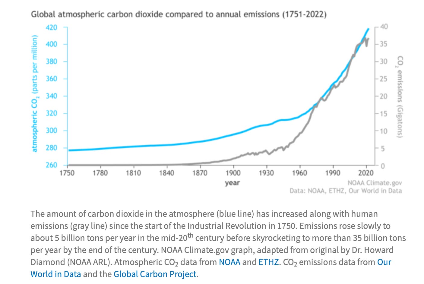
source: https://www.climate.gov/news-features/understanding-climate/climate-change-atmospheric-carbon-dioxide
So realistically there has been negligible rise in seal level in some areas and in fact lowering sea levels in others particularly in Scandinavian area.
There has been a modest rise in Co2 levels since the Industrial Revolution but there has also been huge population increases in that time.
The facts are that we are trying to explain climatic changes in terms of human intervention / impact but there are a thousands of variable affecting our planet and much of those we have no real understanding of .. just assumptive guesses. Meanwhile the hysteria created by climate change alarmists is causing untold damage to western societies and enriching those that in my view sensibly ignore the doom and gloom and push towards better standards of living and taking people out of poverty.
Thanks for sharing this Creon.
If I remember correctly, the dropping sea levels in the Nordic countries (like Stockholm in your plot) is usually explained by invoking isostatic rebound.
https://en.wikipedia.org/wiki/Post-glacial_rebound